Garden Room Extension
Location: Trinity, Edinburgh
As anyone who has spent any time property hunting will know, so much can hang on first impressions. Even the most wonderful living space can fail to make the kind of positive impact expected of it if the only way to reach the property is through a dark, dismal entrance.
Carol and Andrew Anderson encountered this problem when they first went to view their home in Edinburgh’s Trinity. They decided to buy the property, which was arranged over the two upper levels of a substantial Victorian villa, primarily because the scale of the living space was ideal for their family. The couple had been attracted to the building’s generous proportions; they were moving from a Georgian flat in the city’s New Town where they had grown to appreciate the expansive ceiling heights repeated here.
The entrance, however, left much to be desired. The property was approached from the side of the villa and was originally accessed via a stair-tower that was added on to the building when it was split into two separate dwellings around twenty before. Also, while the villa nestles in a large garden that wraps around the side and rear of the building, the upper level felt entirely detached from this external space, which was a particular problem for Carol, a landscape architect.
“From the start, we were thinking about adding a single-storey garden room that would open the house to the garden,” she explains. With this idea in mind, the couple approached Edinburgh-based architect Andrew Burridge, having seen a project he had completed for a friend. Carol in particular appreciated his spare, minimal approach. Initially, the Andersons commissioned a feasibility study, “because we wanted to see how we could ameliorate the old stairway, and also exactly what we could get for our money.”
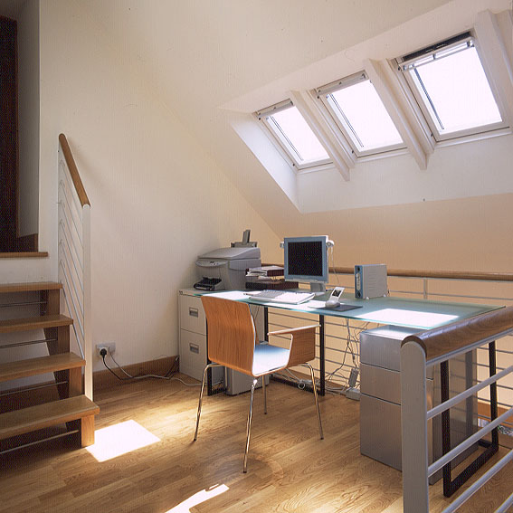
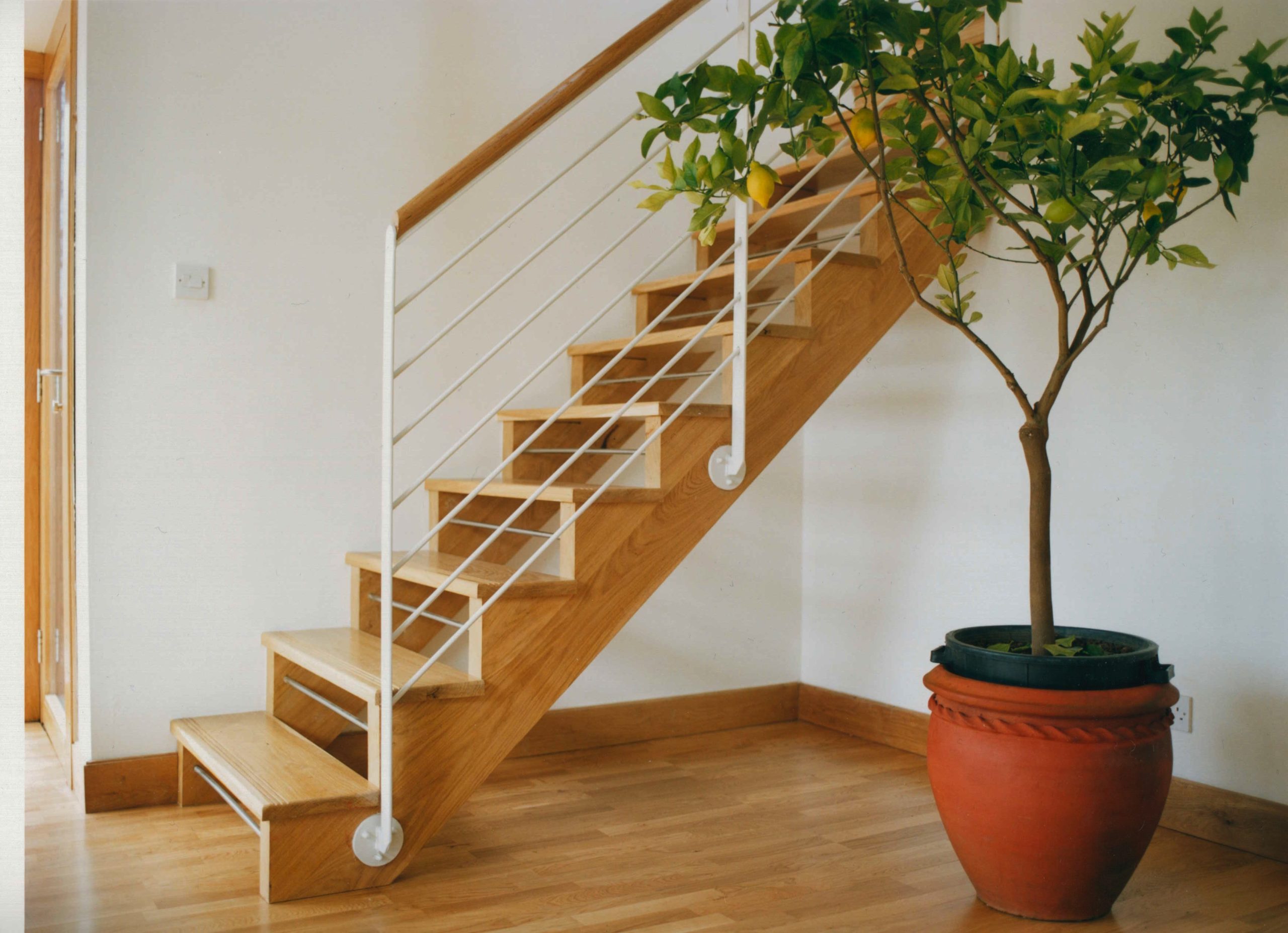
Carol’s professional situation had also changed since the couple bought the property after she became self-employed and needed to work from home. At first an office was set up in the spare bedroom, but this proved far from ideal. “Every time people came to stay, I had to pack away all my things, and it became clear I needed to create an office space away from the hubbub of the house,” she says. The logical solution was to integrate the office space into the new extension. “We spent a long time thinking of solutions around the staircase, and finally realised that we needed to come up with something more radical,” Carol explains.
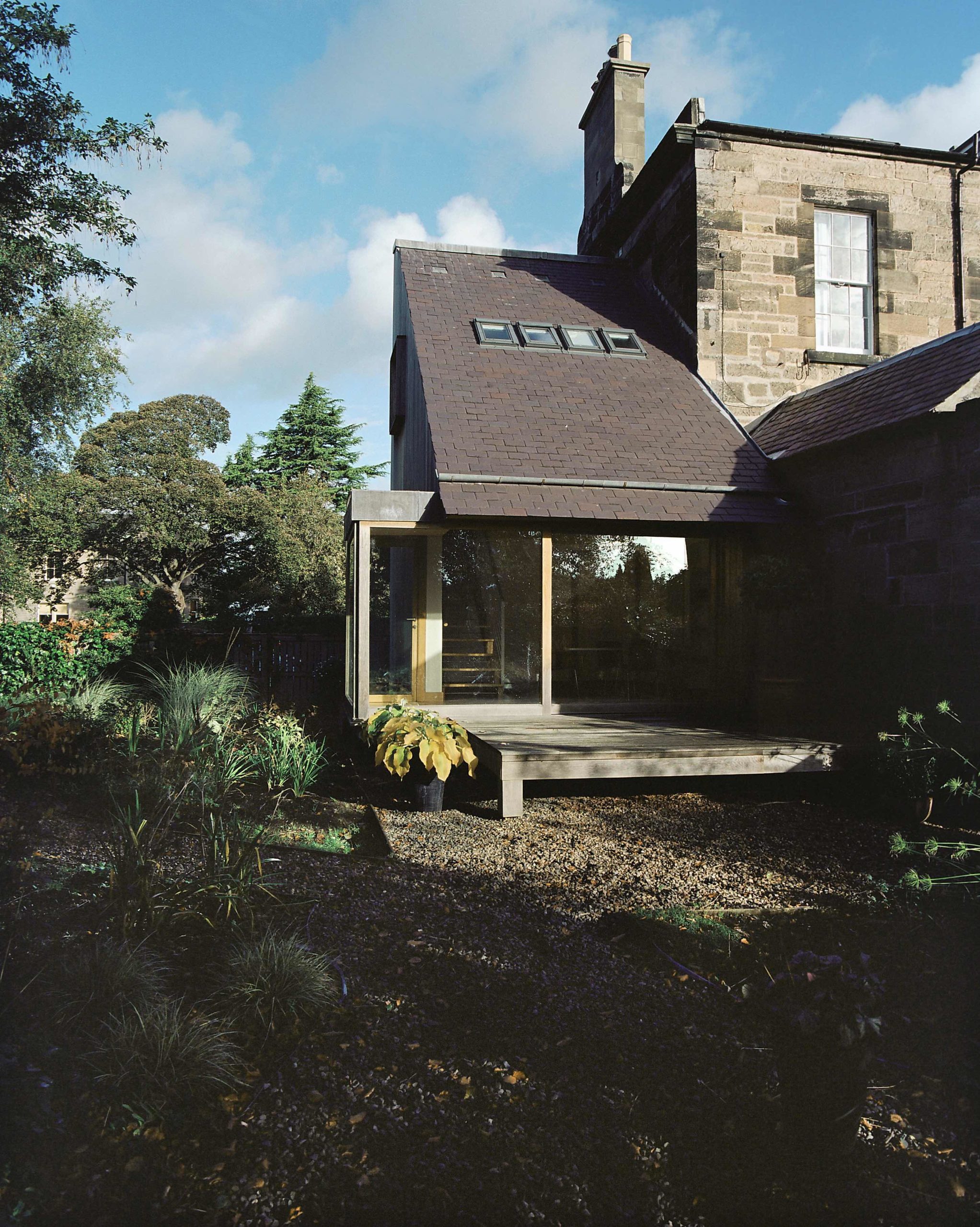
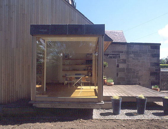
The result is a striking double-height space that will come as something of a surprise to anyone who assumes an extension has to connect to the house at ground level. This was the first extension of this type that the architects had worked on, and it was certainly the largest domestic project that the couple themselves had become involved in. It was, Carol acknowledges, a lengthy process. Three years passed between the initial feasibility study and the completion of the building, “but that was because of Andrew and I rather than the project itself,” she explains. “we needed time to think as well as to raise capital.”
Rather than attempt some form of pastiche to blend with the original Victorian detailing – which was neither the Andersons’ nor Burridge’s cup of tea – both the clients and architect decided on an entirely contemporary approach to the space
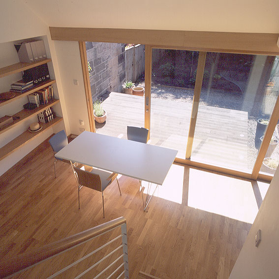
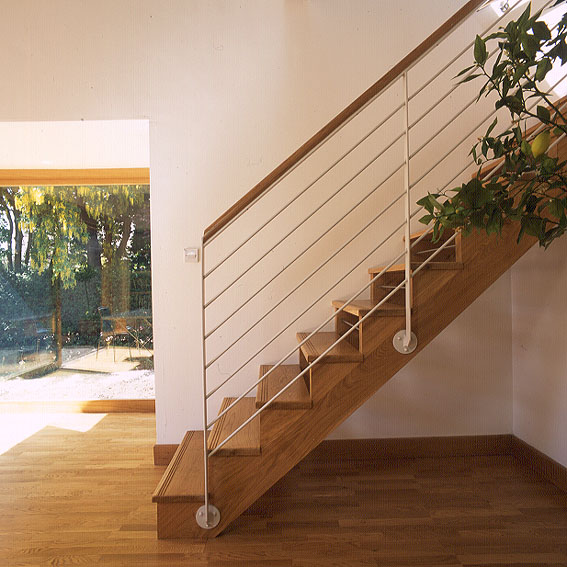
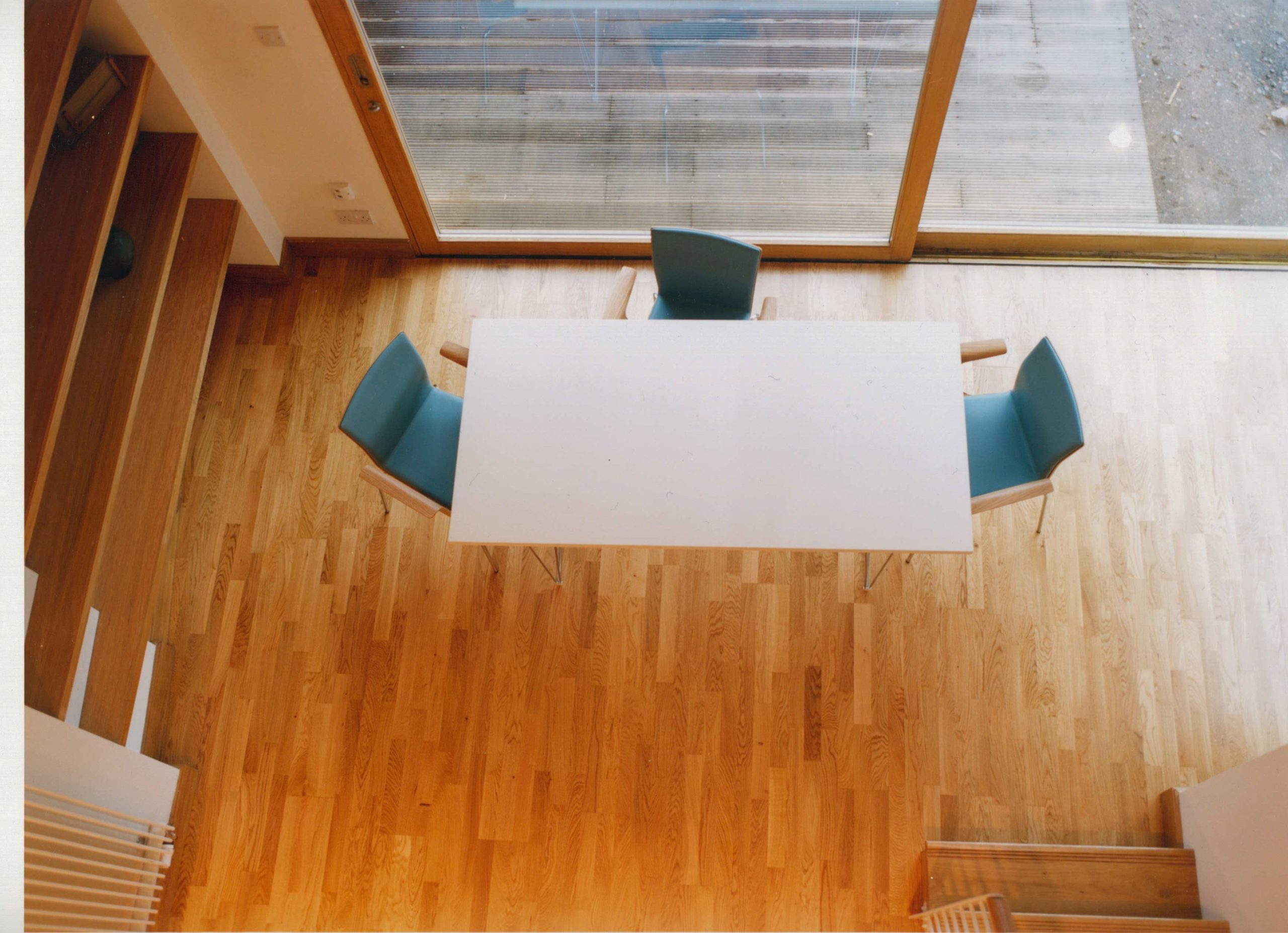
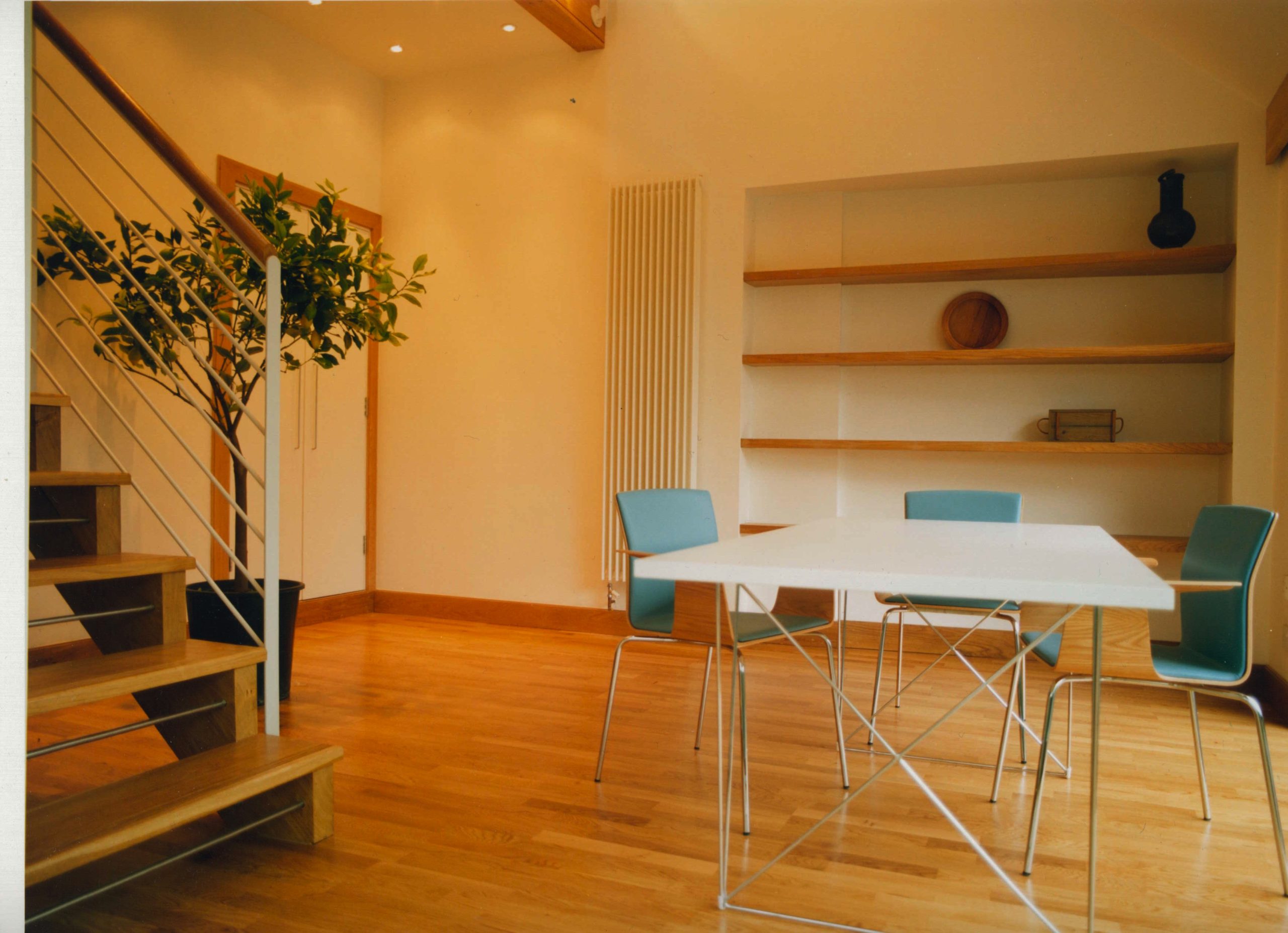
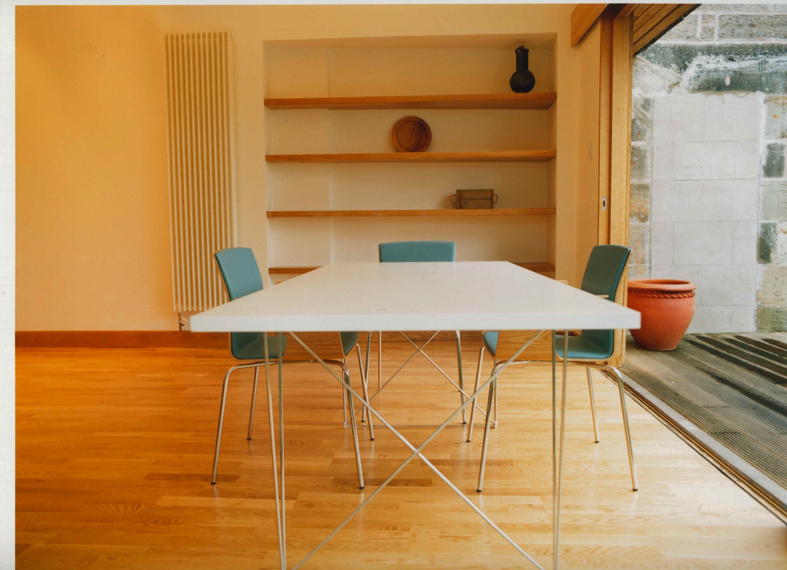
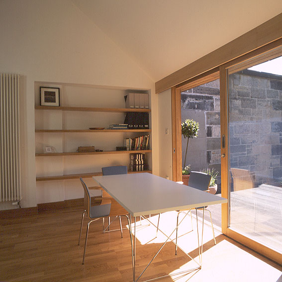
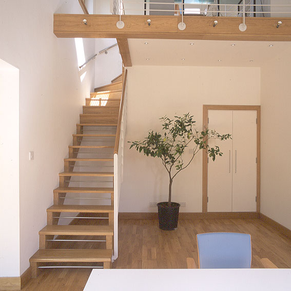
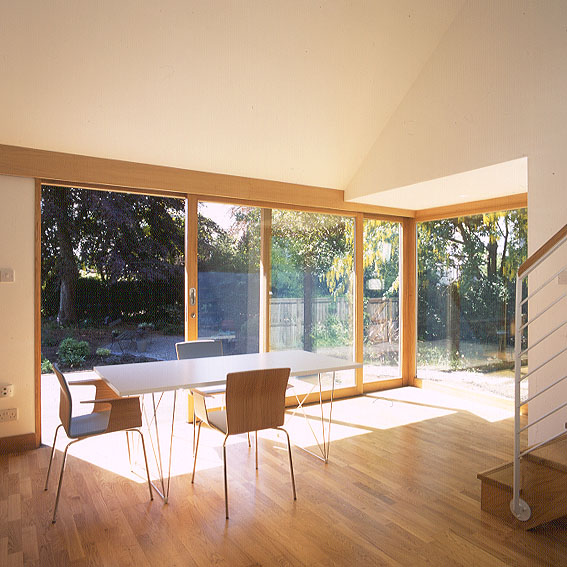
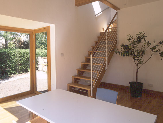
“We couldn’t have afforded to use stone,” admits Carol, “but in any case, we wanted something much crisper and more modem.” A newly clarified and suitably welcoming entrance leads directly to the ground-level garden room, which is glazed on two sides. Large, timber-framed, glazed sliding doors access the decked patio that in tum overlooks the main garden. A timber and metal staircase leads up to Carol’s office, which is lit by a window at the side and from rooflights above, while this space in turn accesses the main house.
‘The challenge for me was in dealing with a pitched roof building in a modernist way,” says Burridge. He tackled this with a refined simplicity of design coupled with a restrained palette of materials. Solid oak is used throughout, both externally on the timber cladding and the framing of the glazed sections, and internally on the flooring, stairwell, mezzanine deck, and the open shelving in the garden room. “I like the way the oak will age and weather extremally”, says Carol, and this weathering process is already apparent in the silvery-grey finish of the decking, which now subtly echoes the shades of the main building’s existing stonework.
Indeed, the simple palette, combining this oak with glass and crisp white plastered walls, creates a sense of visual calm, particularly important in what has to be both a working environment and a place to relax. The striking design also draws the gaze outside to the ever-changing landscape of the garden. This renewed relationship with the garden has brought another dimension to the living space,” says Burridge
The furniture reflects the understated quality of the architecture. In the garden space, oak and pale blue leather Gärsnäs ‘Bird’ chairs from Tangram are combined with a white laminate Tavolo’ trestle table by Studio Tecnico. The slim chrome legs on the chairs and the refined chrome trestle table create an almost floating quality to the pieces. Upstairs, Carol chose a sandblasted glass trestle tabie from Habitat for her office, again maintaining the airy simplicity of the space.
“The extension has an almost Japanese look,” Carol reflects. And the cool simplicity of the garden room has changed the way the family use the house. We had an ‘extension warming’ party and the space came into its own, with people spilling outside,” she says. “The garden is no longer an afterthought.”
Text by Fiona Reid
First published in Homes & Interiors Scotland